How to convert your desktop navigation to a mobile navigation in Squarespace 7.1
This tutorial will show you how to convert your navigation to a mobile hamburger icon navigation in Squarespace. This solution is credited to tuanphan.
Complexity: Easy
Step 1
From your Squarespace account, go to the Custom CSS Editor and paste the code below into the Custom CSS editor box.
@media screen and (min-width:768px) {
 /* hide  header navigation */
    .header-nav {
    display: none;
}
/* Hide header buttons */
.header-actions {
    display: none;
}
/* show burger  menu*/
.header-burger {
  display: flex;
}
/* Show overlay mobile menu */
.header--menu-open .header-menu {
opacity: 1;
visibility: visible;
}
}
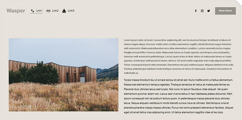
Desktop menu
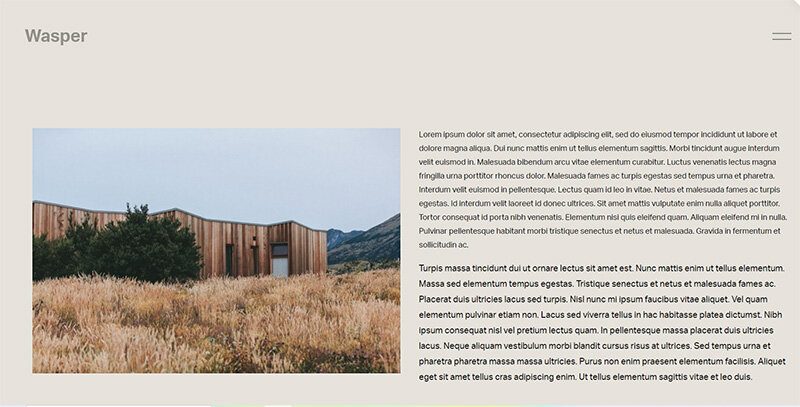
Mobile menu
If you have any questions or need any help with your Squarespace website design, you can book a 1:1 consultation.
All work in this guide is provided ‘as-is’. Other than as provided this guide makes no other warranties, expressed or implied, and hereby disclaims all implied warranties, including any warranty of fitness for a particular purpose.
If you require professional advice, you can book our consultation services.

 Primitus Consultancy
We work with small and medium-sized businesses to help create a professional online presence. We provide a one shop full-service design studio in London, United Kingdom.