How to add custom icons images to Squarespace 7.1 navigation
This tutorial will show you how to add custom icons to Squarespace 7.1 navigation. If you have not yet upgraded to version 7.1, we suggest you do so.
Complexity: Moderate
Step 1
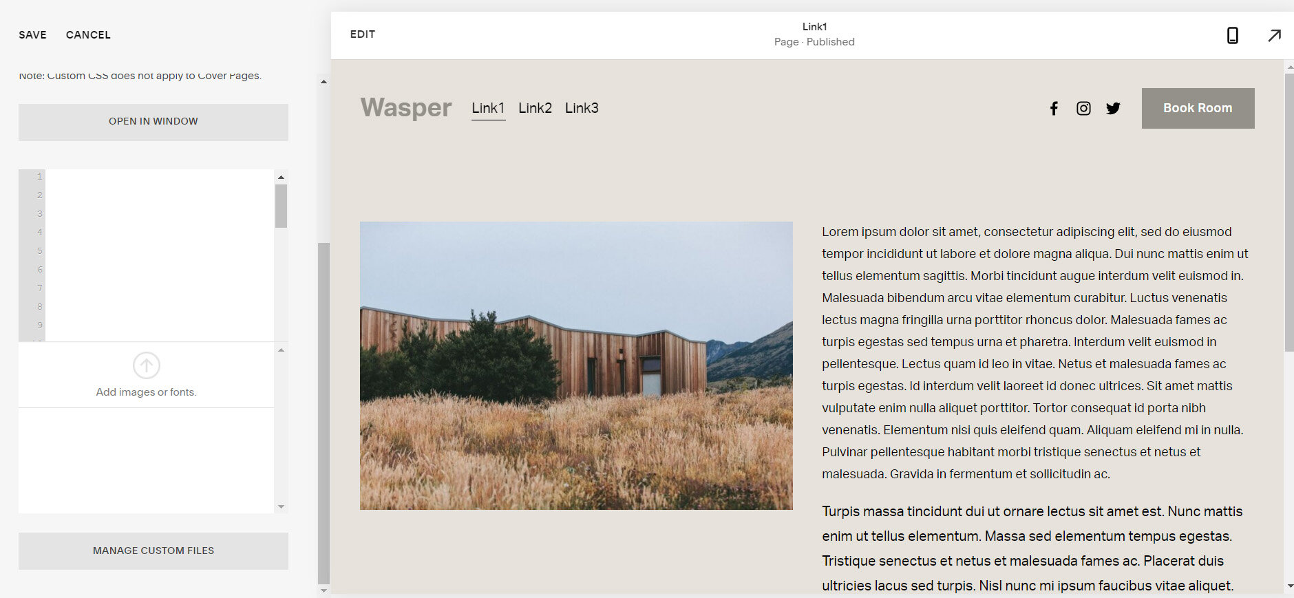
First thing we need to do is upload your icons onto Squarespace.
From the Squarespace dashboard navigate to:
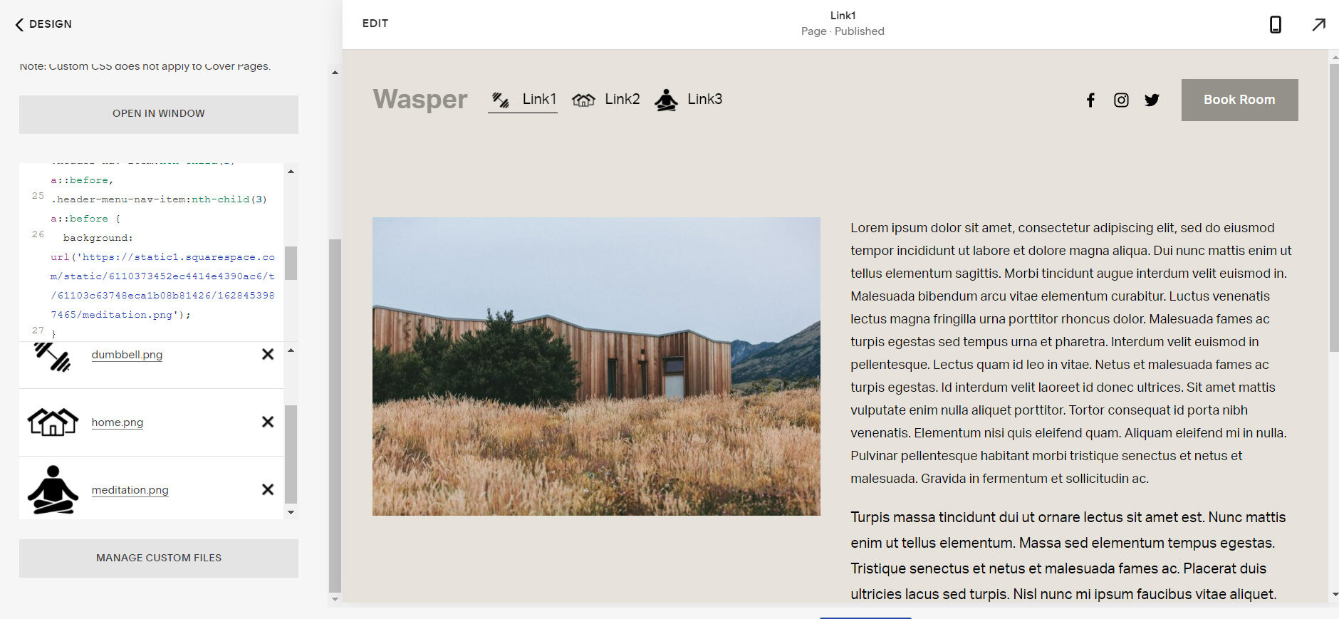
Design > Custom CSS and at the bottom click on the 'MANAGE CUSTOM FILES' button and then click on the 'Add image or font' button to upload your icon images.
Step 2
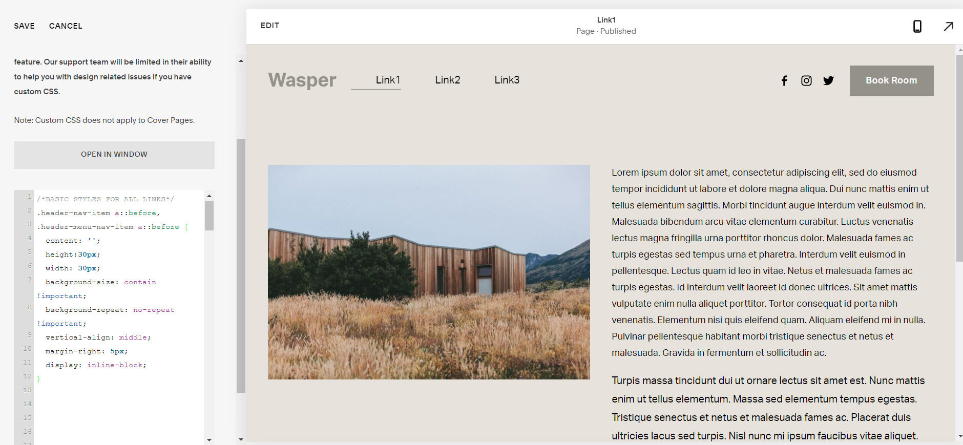
The next step will be to add the basic styles for all the links for both desktop and mobile devices.
/*BASIC STYLES FOR ALL LINKS*/
.header-nav-item a::before,
.header-menu-nav-item a::before {
  content: '';
  height:30px;
  width: 30px;
  background-size: contain !important;
  background-repeat: no-repeat !important;
  vertical-align: middle;
  margin-right: 5px;
  display: inline-block;
}
Step 3
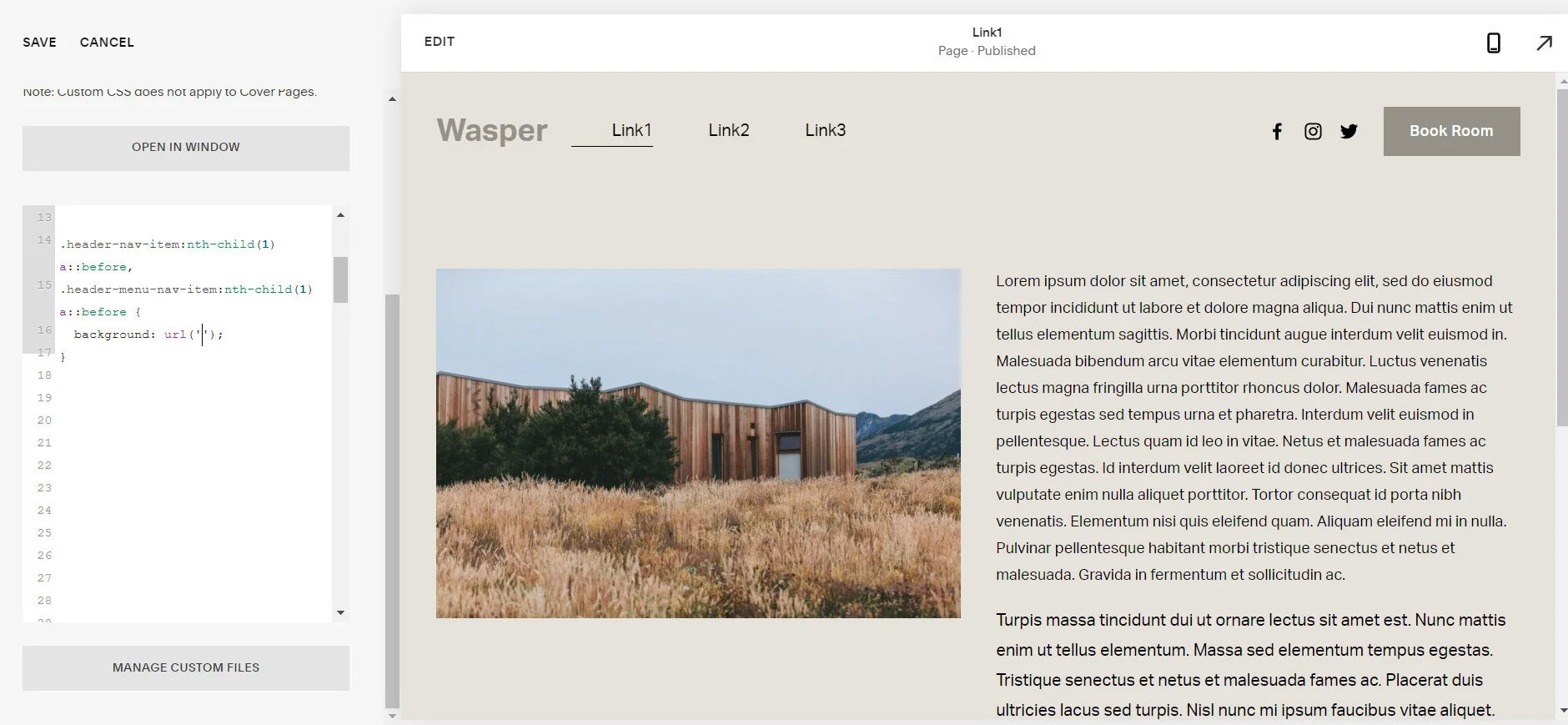
Add code for specific link. To select only the specific link then we can use :nth-child.
.header-nav-item:nth-child(1) a::before,
.header-menu-nav-item:nth-child(1) a::before {
  background: url('');
}
* change the number depending on which link you want to select 1, 2 ,3 etc.
Step 4
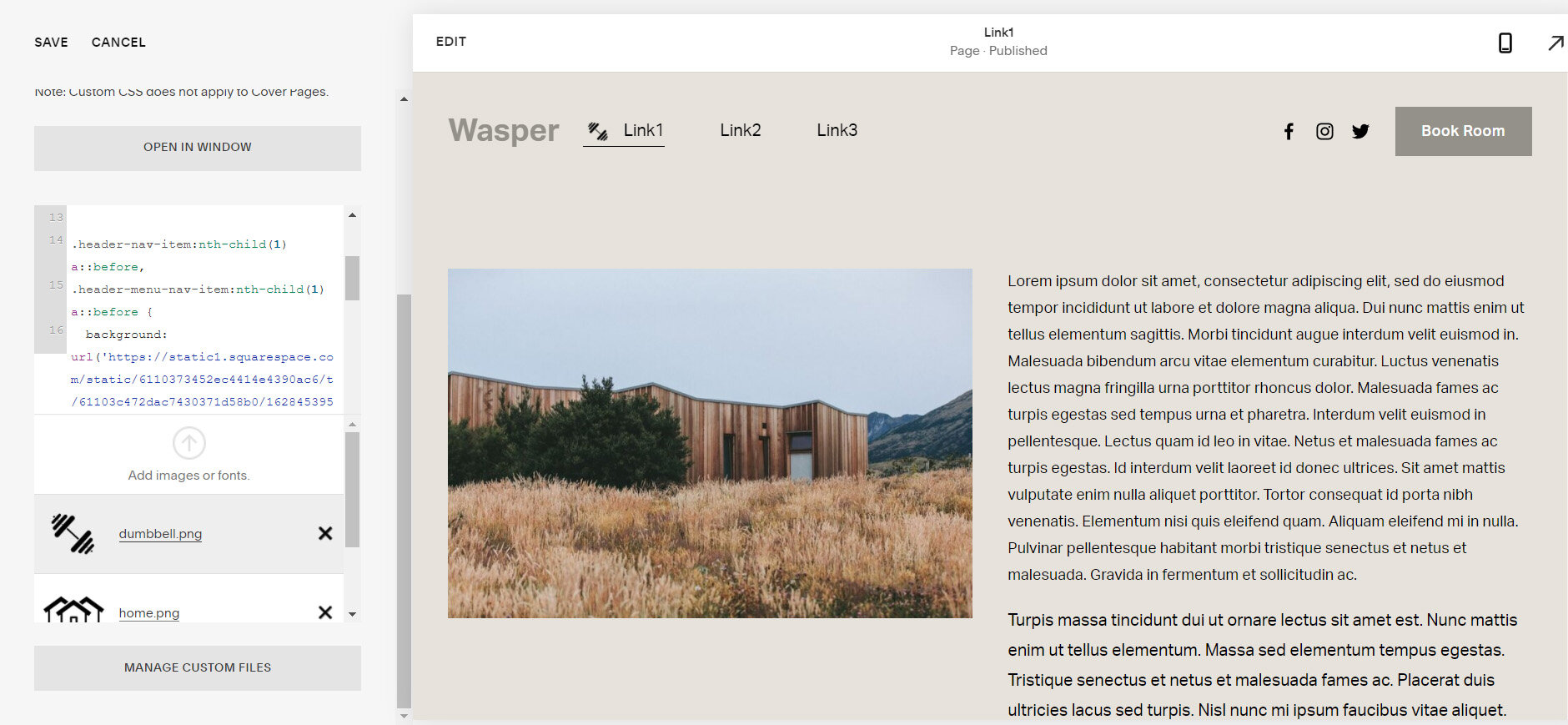
Assign icon to link.
To do this place your cursor in between ' ' in background: url (' '); line.
Then click the ‘MANAGE CUSTOM FILES’ to show the icons. Then click on the icon to be assigned to the link once.
Step 5
Different icon for each link.
Repeat steps 3 and 4. Below are the codes for link 2 and link 3.
.header-nav-item:nth-child(2) a::before,
.header-menu-nav-item:nth-child(2) a::before {
  background: url('');
}

.header-nav-item:nth-child(3) a::before,
.header-menu-nav-item:nth-child(3) a::before {
  background: url('');
}
If you have any questions or need any help with your Squarespace website design, you can book a 1:1 consultation.
In this tutorial, you'll learn how to create a multiple column dropdown menu in Squarespace website. This tutorial is specifically designed for Squarespace 7.1..
In this tutorial, you'll learn how to customise the shopping cart colors in Squarespace website. This tutorial is specifically designed for Squarespace 7.1.
In today’s digital age, inclusivity is not just a moral responsibility but also a legal requirement. ADA (Americans with Disabilities Act) compliance ensures that websites are accessible to everyone, including individuals with disabilities. For businesses using Squarespace, achieving ADA compliance can have a significant impact on both user experience and business growth.
In this tutorial, you'll learn how to create a pulsating button on your Squarespace website. This tutorial is specifically designed for Squarespace 7.1.
In this tutorial, you'll learn how to resize the newsletter block on your Squarespace website. This tutorial is specifically designed for Squarespace 7.1.
Transforming the last navigation item in your Squarespace mobile menu into a button can enhance your site's design and improve the user experience. This guide will walk you through the steps to achieve this customization in Squarespace 7.1.
In this tutorial, you'll learn how to change 'View Event' text and 'Back to All Events' text on your Squarespace website. This tutorial is specifically designed for Squarespace 7.1.
In this tutorial, you'll learn how to add a button to the mobile header on your Squarespace website. Adding a button to the mobile header of your website can significantly enhance user experience by providing quick access to essential features or pages. This tutorial is specifically designed for Squarespace 7.1.
In this tutorial, you'll learn how to dynamically change the text of the "Quick View" button on your Squarespace website. This tutorial is specifically designed for Squarespace 7.1.
This quick tutorial will guide you on how to ensure the "Quick View" button is always visible. This tutorial is specifically designed for Squarespace 7.1.
This tutorial will guide to how to overlap images in auto carousels This tutorial is applicable for Squarespace 7.1. Auto carousels are a popular feature on modern websites, offering a dynamic and interactive way to showcase content. One innovative design trend within these carousels is the use of overlapping images.
This tutorial will guide to how to implement ‘Read More’ segment. This tutorial is applicable for Squarespace 7.1 and 7.0. The "Read More" button offers a streamlined and user-friendly approach to content management on digital platforms.
This tutorial will guide to how to hide the hamburger menu on mobile. This tutorial is applicable for Squarespace 7.1.
This tutorial will guide to how to hide the hamburger menu on mobile. This tutorial is applicable for Squarespace 7.1.
This tutorial will guide you through the simple process of effortlessly switching between enabling and disabling comments on your Squarespace website.
This tutorial guides you on altering the font and size of your previous and next blog post titles that appear at the bottom of your current blog.
Squarespace is a popular website-building platform that caters to a wide range of users, from individuals and small businesses to larger enterprises.
In the dynamic realm of web design, the integration of Artificial Intelligence (AI) is reshaping the landscape, offering innovative solutions and transforming the way websites are created. This blog explores everything you need to know about harnessing the power of AI as a website designer, from its fundamental concepts to practical applications and future implications.
In the fast-paced world of online business, catching and holding your audience's attention is crucial. One effective way to achieve this is by incorporating Infinite Counters into your website.
This tutorial demonstrates how to create multiple instances of infinite counters on your Squarespace webpage.
When it comes to creating an engaging and visually appealing website on Squarespace, the devil is in the details. While most website builders offer standard navigation menus, Squarespace allows you to take customization a step further by giving you the ability to use different colors for your navigation links.
In the world of e-commerce, every pixel on your website has the potential to impact the user experience. One design consideration that often escapes immediate attention is the shopping cart icon. While it's a staple of online shopping, have you ever thought about why you might want to hide it when the cart is empty? Let's delve into the rationale behind this subtle yet impactful design choice.
In this tutorial, you'll learn to hide the shopping cart icon when it's empty, streamlining your website's design and enhancing the user experience.
In the vast world of website creation, Squarespace stands as a popular choice for individuals and businesses alike. With its user-friendly interface and stunning pre-designed templates, Squarespace offers a seamless platform to build beautiful websites.
In today's digital landscape, it's no surprise that your clients or customers are increasingly using their mobile phones to search for products or services. Whether you're selling tangible goods or offering valuable services, mobile purchases are now a significant part of the eCommerce industry, accounting for roughly half of all sales.
In the ever-evolving digital landscape, ensuring your website is performing at its best is essential for success. However, pinpointing areas of improvement and making informed decisions can be a daunting task.
Learn how to conduct a comprehensive website audit to identify areas of improvement and take your website to the next level.
All work in this guide is provided ‘as-is’. Other than as provided this guide makes no other warranties, expressed or implied, and hereby disclaims all implied warranties, including any warranty of fitness for a particular purpose.
If you require professional advice, you can book our consultation services.
We work with small and medium-sized businesses to help create a professional online presence. We provide a one shop full-service design studio in London, United Kingdom.

