How to have form elements side by side in a Form
In this tutorial, you'll learn how to have form elements side by side in a form. This tutorial is specifically designed for Squarespace 7.1.
Forms are a critical part of user interaction on websites, whether for signing up, purchasing products, or gathering feedback. How form elements are arranged can significantly impact the user experience and overall efficiency of the form. One design trend that has gained popularity is placing form elements side-by-side instead of stacking them vertically. Here, we explore the advantages of this approach.
Table of Contents
Why Side-by-Side Form Fields Matter
In this blog, we explore the advantages of this approach and how it can benefit your site.
Enhanced Visual Appeal: Arranging form elements side-by-side creates a cleaner, more modern look. Instead of a long, vertical list of fields, a well-designed horizontal layout can break the monotony and make the form visually balanced. This aesthetic appeal can lead to better engagement, as users often associate a polished design with professionalism and trustworthiness.
Improved Usability: Forms with side-by-side fields are easier to navigate, especially when dealing with related inputs. For instance:
Name fields: First Name and Last Name make sense to be side by side, as they are naturally connected.
Address fields: Street and apartment number, or city and zip code, work better when aligned horizontally.
This logical grouping reduces cognitive load, allowing users to fill out forms faster and with fewer errors.
Space Efficiency: On wider screens, a vertical form layout can waste valuable space, especially when each field occupies an entire row. A side-by-side arrangement makes better use of horizontal screen real estate, leaving room for additional content like instructions, images, or call-to-action buttons..
Optimized for Multi-Column Layouts: Side-by-side forms align perfectly with multi-column layouts, which are often used in web design. These layouts can improve the flow of the page by seamlessly integrating the form with other elements, such as supporting text or promotional banners..
Faster User Completion: By reducing the number of vertical scrolls, side-by-side forms can speed up the completion process. Users are more likely to stay engaged when they can view and interact with multiple fields without needing to scroll repeatedly. This is especially important for longer forms..
Better Responsiveness: When implemented correctly, side-by-side layouts can adapt well to different screen sizes. While they appear horizontally aligned on larger screens, they can stack vertically on smaller devices like smartphones. This responsiveness ensures an optimal user experience across all devices.
Professional Presentation: Side-by-side form elements convey a sense of organization and thoughtfulness in design. For businesses, this professional look can increase credibility, making users more comfortable sharing their information.
Complexity: Moderate
How to create form elements side by side in a Form in Squarespace
To implement form elements side by side in a Form in Squarespace follow the steps below.
Step 1
How to Arrange Form Elements Side by Side: A Step-by-Step Guide
1. Use Flexbox for Layout
Set the parent container of the form fields to
display: flex.Use
flex-wrap: wrapto allow fields to wrap to the next row if needed.
/* form elements side by side */
.field-list {
  display: flex;
  flex-wrap: wrap;
}
Step 2
Assign Full-Width Fields
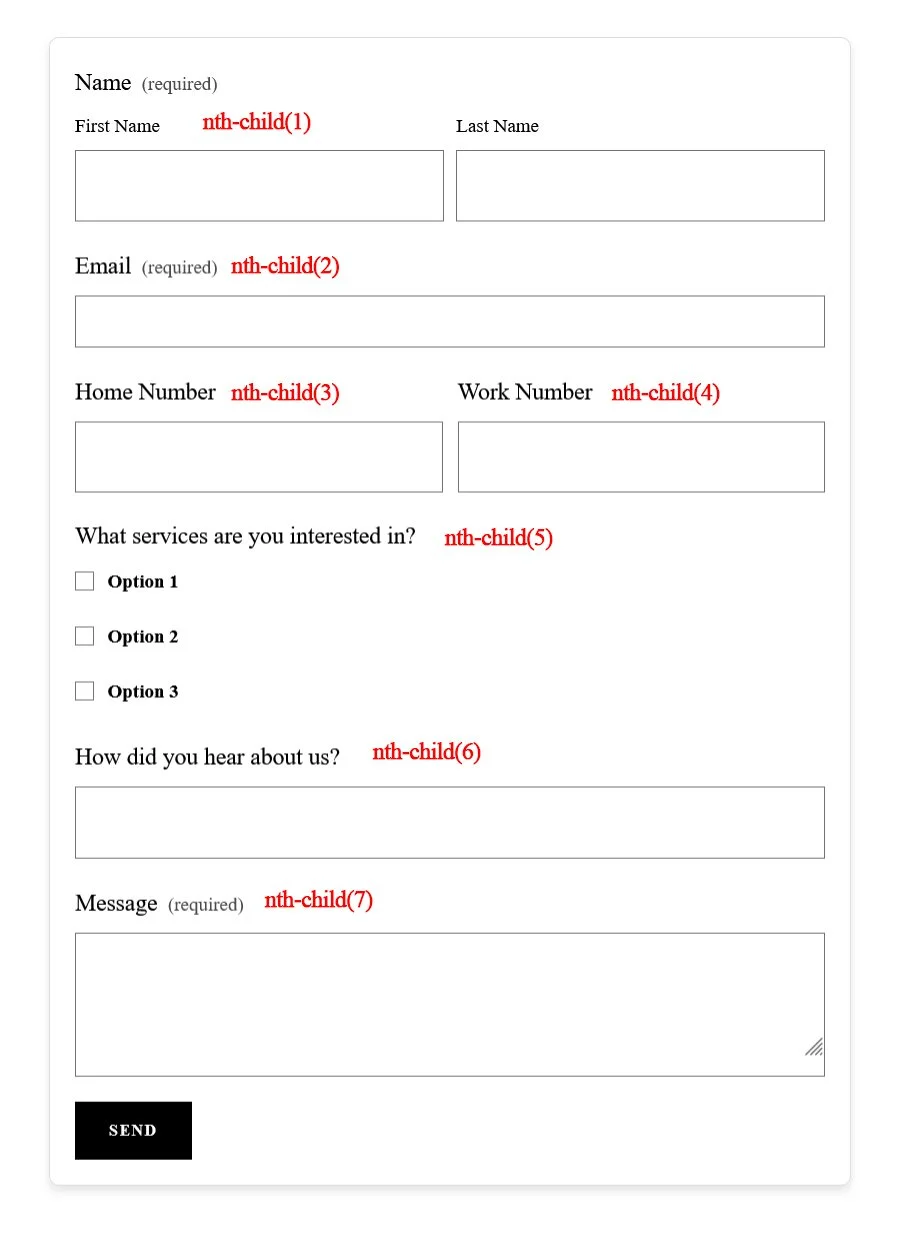
Identify the fields that need to span the entire row (e.g., Name, Email, Message).
Use
flex: 0 0 100%for these fields.
/* form elements side by side */
.form-item:nth-child(1),
.form-item:nth-child(2),
.form-item:nth-child(5) {
  flex: 0 0 100%;
}
Step 3
Arrange Fields Side by Side
Select fields that should sit next to each other (e.g., Home Number and Work Number).
Assign them a width of approximately half the container (e.g.,
49%).Add spacing between fields using
margin-right.
/* form elements side by side */
.form-item:nth-child(3),
.form-item:nth-child(4) {
  flex: 0 0 49%;
}
.form-item:nth-child(3) {
  margin-right: 2%;
}
Step 4
Ensure Responsive Design
For smaller screens, stack all fields vertically by overriding styles with a media query.
@media (max-width: 768px) {
  .form-item {
    flex: 0 0 100%;
    margin-right: 0;
  }
}
Step 5
Test and Fine-Tune
Check the layout on different devices to ensure it looks good across desktops, tablets, and mobiles.
Adjust spacing, alignment, and widths as needed for a polished look.
Step 6
Full working example
Copy the code below and from the Squarespace dashboard navigate to Pages > Custom Code > Custom CSS and paste the code.
/* form elements side by side */
[#FORMBLOCKIDNUMBER] {
  .field-list {
    display: flex; /* Enables a flexible layout for form items */
    flex-wrap: wrap; /* Allows items to wrap to the next row if they exceed the container width */
  }

  /* Full-width items */
  .form-item:nth-child(1), /* Applies to the first form item (e.g., Name field) */
  .form-item:nth-child(2), /* Applies to the second form item (e.g., Email field) */
  .form-item:nth-child(5), /* Applies to the fifth form item (e.g., "How did you hear about us?" field) */
  .form-item:nth-child(6), /* Applies to the sixth form item (if present) */
  .form-item:nth-child(7) { /* Applies to the seventh form item (if present) */
    flex: 0 0 100%; /* Makes these items span the entire width of the container */
  }

  /* Side-by-side items */
  .form-item:nth-child(3), /* Applies to the third form item (e.g., Home Number field) */
  .form-item:nth-child(4) { /* Applies to the fourth form item (e.g., Work Number field) */
    flex: 0 0 49%; /* Makes each item take up 49% of the container width */
  }

  .form-item:nth-child(3) {
    margin-right: 2% !important; /* Adds 2% spacing to the right of the third item */
  }

  @media (max-width: 768px) { /* Media query for screens with a max width of 768px (mobile-friendly) */
    .form-item {
      flex: 0 0 100% !important; /* Stacks all items vertically by making them full width */
      margin-right: 0 !important; /* Removes any right margin to prevent spacing issues */
    }
  }
}
Note: A useful tool you can use to identify the #FORMBLOCKIDNUMBER is a Chrome Extension called Squarespace ID Finder.
Key Takeaways
Use Flexbox to create horizontal layouts for form fields
Improves usability, aesthetics, and efficiency
Responsive design ensures mobile-friendliness
Apply custom CSS targeting your specific form block
FAQs
Can I use this technique with all form blocks in Squarespace?
Yes, but you must apply the CSS to each form block's unique ID for precise styling.
Will the form still work well on mobile?
Absolutely. The included media query ensures the layout stacks vertically on smaller screens.
How do I find the form block ID?
Use the **Squarespace ID Finder** Chrome Extension to easily locate your form block ID.
Can I customize the field widths?
Yes. Adjust the `flex` and `margin-right` values as needed to get your desired layout.
Conclusion
Arranging form elements side by side can greatly enhance user experience, making forms not only visually appealing but also functional and efficient. This layout minimizes clutter, reduces completion time, and adapts well to various screen sizes, all while improving the overall perception of your brand. By implementing this design strategy thoughtfully, you can create forms that users are happy to interact with, leading to better engagement and higher conversion rates.
See other blogs
If you have any questions or need any help with your Squarespace website design, you can book a 1:1 consultation.
All work in this guide is provided ?“AS IS”. Other than as provided in this agreement, this guide makes no other warranties, express or implied, and hereby disclaims all implied warranties, including any warranty of fitness for a particular purpose.
If you require professional advice, we recommend that you purchase the services of a developer.


